Brand(ing) New: Rice updates logo
This past summer, Rice worked with the Houston-based design firm Hawkeye to update the Rice logo, which had been in place for at least 12 years.
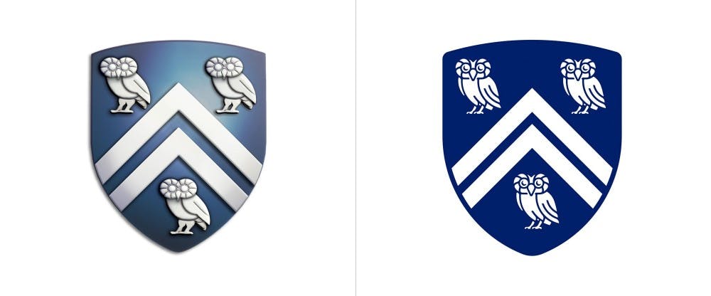
According to the Hawkeye website, the firm was tasked with updating the logo as well as standardizing branding for different departments across the university. The new logo features a matte, dark blue for the shield as well as a new font, Galaxie Copernicus, for the academic schools.
“Hawkeye designed the new owl to retain the most memorable aspects of the original design, specifically the eyes and feathers around them, the engaged pose and prominent wing,” the Hawkeye website said.
The change to the Rice University logo comes two years after a change to the Rice University Athletics logo made in partnership with Torch Creative, a design studio based in Dallas specializing in sports team logos.
The Hawkeye website described Rice University as “an environment built around the freedom of individuals to pursue their passion without the burden of outside influence.”
In the description of the project, Hawkeye said that one of their main goals was to create brand unity across the university.
“In the corporate arena, branding is ruthlessly enforced,” the design firm wrote in their description of the project. “In academia, there is no such enforcement, only independence and organizational silos [of isolation within different departments].”
According to Christine Church, director of marketing in the Office of Public Affairs, the changes include broadening the official color palette and introducing new typefaces, rolling out a flat version of the Rice shield and minor refinements to the Athenian owl that will make these symbols easier to use online, in print and with promotional items.
Rice University branding is Hawkeye’s most recent project. On their website, Hawkeye lists clients in education, energy and technology. In the past, they have worked with clients such as Houston Methodist and George Strait Reserve.
According to Church, the new logo is part of a larger refresh to the overall brand that was launched in July.
“We are also proud to say that the owl no longer has ‘turkey’ legs, and now has a consistent line width. While maintaining the feel of the original Athenian owl, the new Rice owl presents a stronger feel of strength and pride,” Church said.
More from The Rice Thresher

Rice to support Harvard in lawsuit against research funding freeze
Rice, alongside 17 other research universities, filed an amicus curiae brief in support of Harvard University’s lawsuit against the Trump administration over more than $2 billion in frozen research grants.

Mayor Whitmire discusses ‘the state of Houston’ between audience protests at Baker Institute
John Whitmire’s remarks on the city’s budget, transportation and infrastructure were interrupted twice by shouts from audience members at a Baker Institute event May 29. At the event, which was open to the public, Whitmire spoke about the current state of Houston alongside former county judge Ed Emmett.

Rice reaffirms support for international students after Trump administration targets Harvard
Rice and the Office of International Students and Scholars said in a May 23 email that they are monitoring the Trump administration’s actions towards Harvard to bar the school from enrolling international students. A federal judge temporarily halted the move less than 24 hours later.
Please note All comments are eligible for publication by The Rice Thresher.